Marketing emails
Everybody loves an engaging marketing email. OK, maybe loves is a little strong, but certainly you could say “most people don’t hate an engaging marketing email, and don’t immediately unsubscribe to the list.”
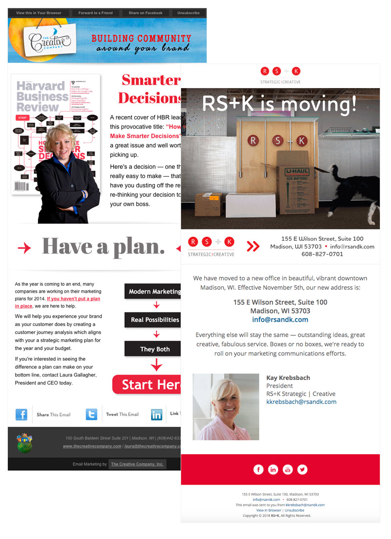
I’ve been fortunate to work with women who are filled with great ideas – currently for Kay Krebsbach at RS+K and right before that for Laura Gallagher at The Creative Company. Not a lot of unsubscribes when they are in charge. It’s been my task to design those ideas and to bring them to life and then to your mailbox.
Pro tip: coding custom email is the hardest markup job you’ll ever do. Because a markup strategy that works in Gmail falls apart in Outlook 2010 but might work ok in Outlook 2007 and in Apple Mail. And somewhere out there, your client’s email subscribers include people who use Outlook 2007 (especially in B2B marketing, where often people in offices don’t get new hardware/software very often).
Many email clients rely on pretty old markup strategies – tables for layout, inline styles for styling. Each client is a little different. Coming up with the right strategy to make an email look good in your target browser and then degrade gracefully in other browsers is pretty tricky.
So when we hit “send” on an email project, I’m always kind of proud. Putting my html markup skills from 2002 to work in 2020!
OK, enough inside baseball.
Graceful degradation
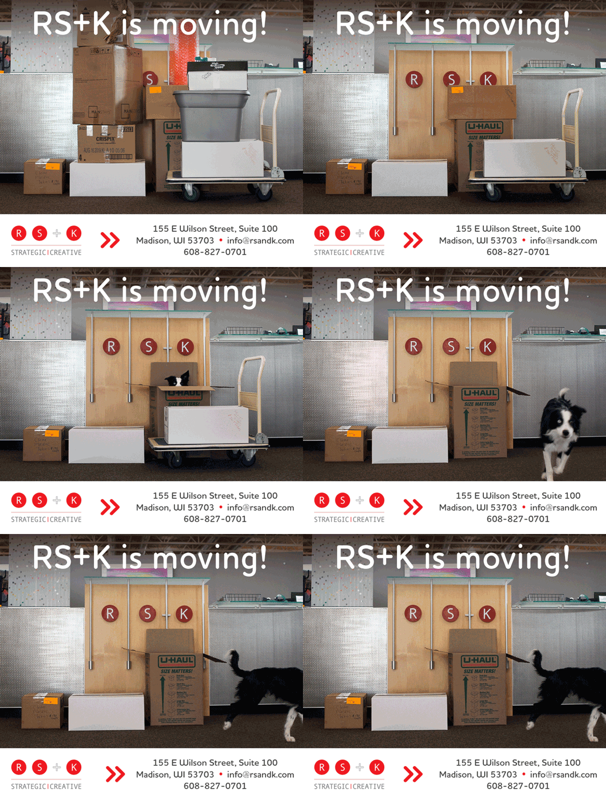
Here’s how the header image in the RS+K “We’re moving” email looked in the email client. Super fun! The dog is my dog Prince, who at the time was not quite a year old and not crazy about me putting him in a box and taking photos over and over again. But we got it! It made a great, engaging email. Unless you’re using Outlook. The Outlook email client doesn’t show animated gifs. It shows the first frame of the gif. The design trick is to make the first frame an image that can stand alone.
If you want to watch it again, refresh the page.
